
Black Friday emails have different jobs at different points in the sale. An early-access email builds anticipation, a sale announcement reveals the offers, a follow-up gives customers another reason to shop, and a last-chance email reminds them when the sale ends.
A good starting point is to plan these campaigns first, then choose designs that fit what each email needs to accomplish.
Plan your Black Friday email campaigns
| Campaign | When to send | What the email should communicate |
|---|---|---|
| Early access and teaser | Before the public sale begins | Build anticipation, invite signups or offer subscribers exclusive access |
| Sale announcement | When the Black Friday sale goes live | Announce the main offer, highlight relevant products and make it easy to shop |
| Follow-up and reminder | During the promotional period | Introduce newly discounted products, highlight a category or remind relevant customers about an existing offer |
| Last chance | When the promotion is approaching its actual deadline | Make the remaining offer and closing deadline clear |
The decisions that sit behind this table — what the sale needs to achieve, which products carry it, and who sees which version — come first. Below are 12 real Black Friday email designs, grouped by campaign stage, to help you plan your own creative.
Early-access and teaser Black Friday emails
Early-access emails give customers a reason to engage before the public sale begins. The design should make the benefit of signing up or shopping early immediately clear, whether that’s exclusive access, a limited shopping window or an early discount.
Subject line ideas:
- Get first access to our Black Friday deals
- Your Black Friday early access starts now
Design approach: Use a simple product-led layout and one signup CTA for teasers. For live early-access offers, feature the discount, exclusive benefit, and shopping CTA above the product selection.
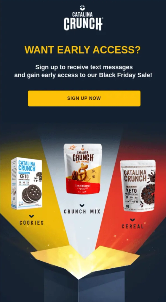
Catalina Crunch
turn early access into a signup opportunity
Catalina Crunch uses a dark navy background, bold yellow typography and a bright signup button to invite subscribers to join its SMS list before Black Friday.
Why it works: The single CTA gives the email a clear purpose. Shoppers know exactly what they’re signing up for without having to navigate several offers.
Black Friday email tip: If you’re building an early-access list, focus the email on the signup benefit. Save the detailed discounts and product promotions for when the sale opens.
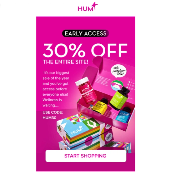
HUM Nutrition
make early access visually unmissable
HUM Nutrition uses a bright pink background, colorful product imagery and a 30% sitewide offer to announce its early-access promotion. The promotional code and shopping CTA are displayed alongside the offer.
Why it works: The bold colors attract attention, while the discount and shopping details are easy to find. Customers can understand the promotion without reading through lengthy copy.
Black Friday email tip: When early access is already live, place the discount, promotional code and primary CTA together near the top. Customers shouldn’t have to search for how to redeem the offer.
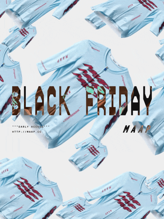
MAAP
lead with the exclusive shopping window
MAAP announces its Black Friday early-access promotion with an invitation to shop before the public sale. Its messaging emphasizes getting in ahead of other shoppers, with savings of up to 50% on selected styles.
Why it works: The email gives existing subscribers a reason to act before the general promotion begins. The early-access benefit becomes the central message rather than competing with several promotional announcements.
Black Friday email tip: If you’re offering early access to a particular customer segment, make the exclusive benefit specific. Tell customers what they can shop, what they’ll save and when their access begins.
Black Friday sale announcement emails
The sale announcement is where customers discover that the promotion is officially live. These emails should lead with the main offer, show which products or categories are included, and make it easy for customers to start shopping.

True Grit Texture Supply
make the sale feel like your brand
True Grit uses illustrated artwork, distressed typography and vibrant colors to announce its 50–70% sale. The distinctive visual style carries through to the featured products and discounted prices.
Why it works: The email looks and feels like True Grit rather than a generic Black Friday promotion. Its visual identity is distinctive without hiding the offer or the products.
Black Friday email tip: Build your sale creative around recognizable elements of your brand. Keep your typography, colors and illustration style consistent, but make sure the discount remains prominent.
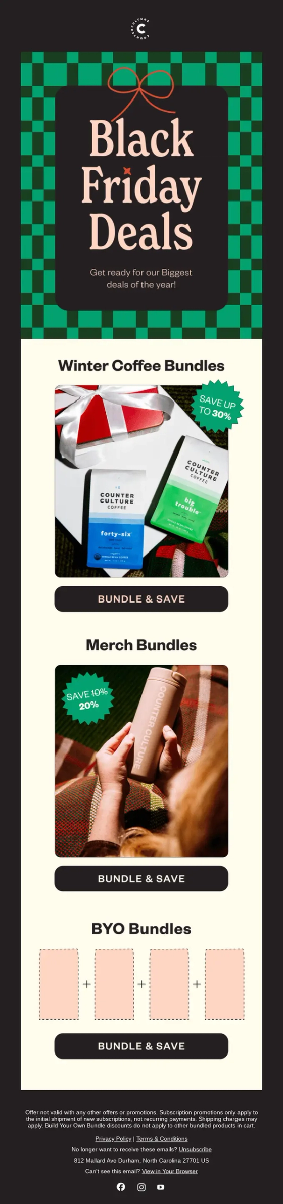
Counter Culture Coffee
give each offer its own space
Counter Culture Coffee organizes its Black Friday sale into separate sections for winter coffee bundles, merchandise and build-your-own bundles. Each section has its own product imagery and shopping button.
Why it works: Instead of squeezing multiple promotions into a single banner, the email gives each offer enough space to be understood. Customers can move directly to the category they’re interested in.
Black Friday email tip: If you’re promoting several offers in one campaign, group them by product category or promotion type. Give each group a clear heading and its own relevant CTA.

Moment
lead with the headline discount
Moment opens with a prominent Up to 60% Off Sitewide message and a shopping CTA. The rest of the email showcases products and explains the offers available across different brands.
Why it works: The headline establishes the main promotion immediately, while the supporting product sections give customers a reason to keep exploring.
Black Friday email tip: Use this shape when the sale spans many products or brands and no single category can carry the message. Keep the individual deals below the headline offer rather than above it.
Black Friday follow-up and reminder emails
A follow-up should give customers a reason to return rather than repeat the original sale announcement. Newly discounted products, category-specific promotions or relevant product reminders can provide that reason.
Make the new information the focus of the design.
Subject line ideas:
- New styles just joined our Black Friday sale
- Still shopping? Save on selected running gear
Design approach: Lead with the new reason to shop. Put the relevant category or products near the top and keep the ongoing promotion visible.
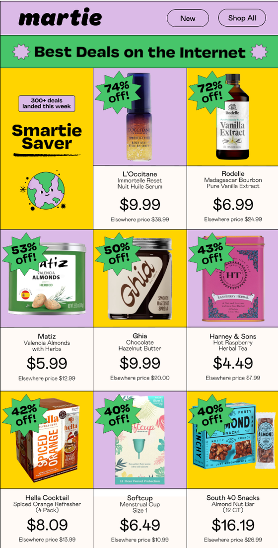
Martie
announce what’s new in the sale
Martie’s Black Friday email announces more than 300 newly added deals across categories such as beauty, household essentials and pantry products. The campaign focuses on the latest additions instead of repeating the original sale announcement.
Why it works: There’s a specific reason for customers to revisit the promotion. The new-deals message also makes the email relevant to shoppers who have already browsed the sale.
Black Friday email tip: If you’re introducing new offers during Black Friday, make those additions the headline. Be specific about what’s new, whether that’s additional products, new categories or bigger discounts.
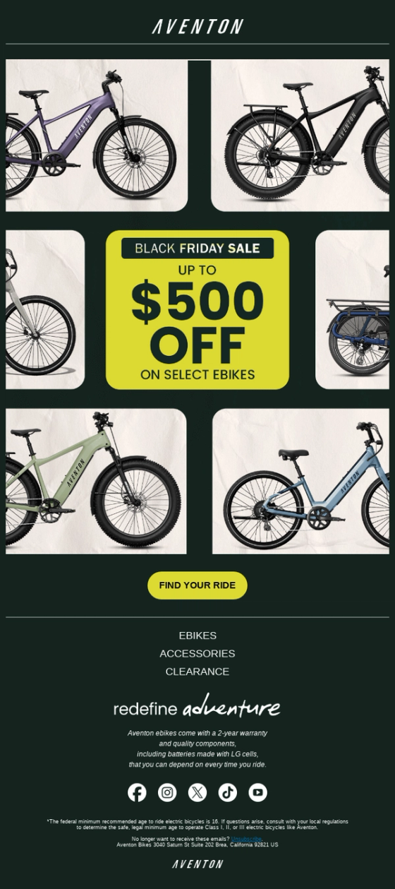
Aventon
remind shoppers about a specific product offer
Aventon displays its Up to $500 Off promotion alongside a grid of electric bikes. The message focuses on the eligible products rather than relying on a broad Black Friday sale announcement.
Why it works: Customers can immediately connect the advertised savings to the products being promoted. They tend to react well to a discount number in actual cost saved rather than as a percentage.
Black Friday email tip: For category-specific reminders, show the actual products included in the promotion. Where possible, display the savings alongside the products instead of repeating a generic discount banner.
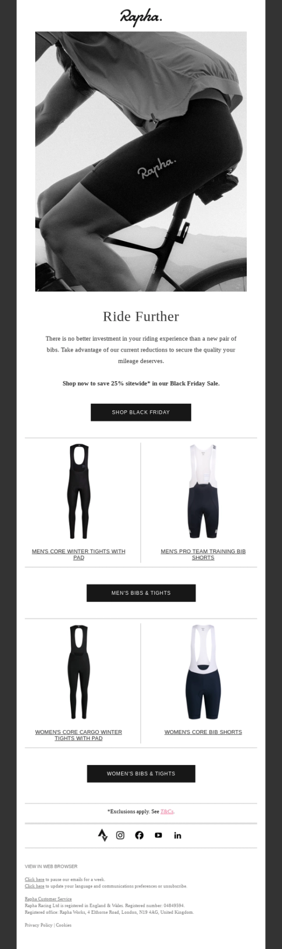
Rapha
make one product category the focus
Rapha uses cycling photography and the headline Ride Further to merchandise a sitewide 25% Black Friday discount through a single category. The email then presents a focused selection of bibs and tights rather than the whole sale.
Why it works: The campaign connects a specific product category with a message that feels natural to the brand, and the offer remains relevant to customers interested in those products.
Black Friday email tip: Use category-specific follow-ups for customers who have previously purchased or shown interest in those products. A focused promotion can be more useful than sending another sitewide sale reminder.
Last-chance Black Friday emails
Last-chance emails should communicate exactly what’s ending and when. The deadline and remaining offer need to be immediately visible, with supporting products or discounts giving customers a reason to act before the promotion closes.
Only use these messages when the deadline is genuine.
Surreal
bring brand personality into the final reminder
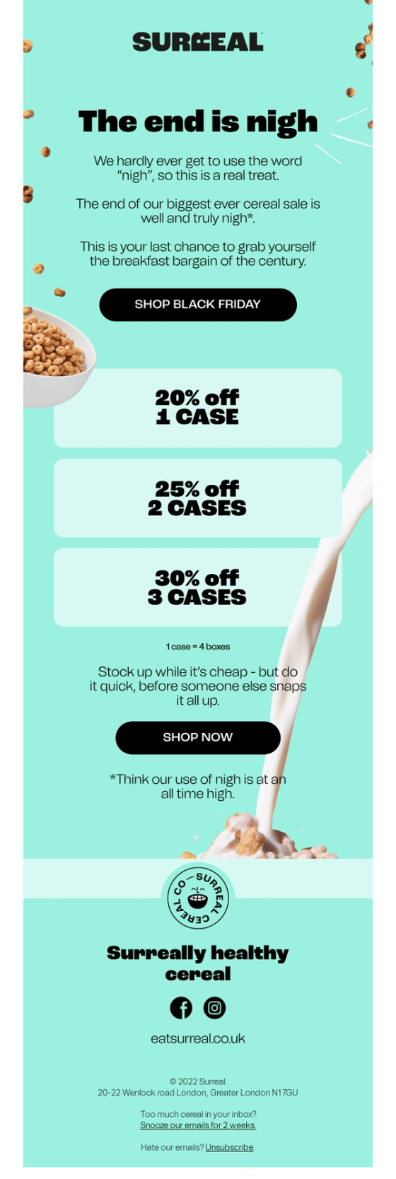
Surreal opens with “The end is nigh,” announcing the final opportunity to shop its biggest sale. The email highlights tiered savings and encourages customers to stock up while prices are low.
Why it works: The email gives customers two reasons to act: the sale is ending, and buying more unlocks a bigger discount. The copy reminds customers that this is the last opportunity to stock up at these prices, while the tiered offers make the savings clear.
Black Friday email tip: Consider combining a genuine sale deadline with tiered discounts for products customers purchase repeatedly. Clearly show how savings increase with quantity, giving customers a reason to stock up before the promotion ends.
HUX
combine urgency with a featured product
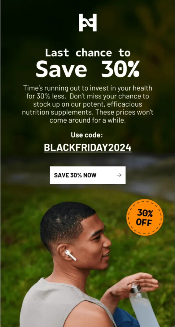
HUX leads with Last Chance to Save 30%, followed by the promotional code and shopping button. It then highlights its Hydration product with a separate product-specific CTA.
Why it works: The expiring discount gets attention first, while the featured product gives customers something specific to purchase.
Black Friday email tip: For your final reminder, consider featuring a bestselling or relevant product alongside the deadline. Make sure the customer can easily see both the offer and where to shop.
Nest
make the deadline and product savings explicit
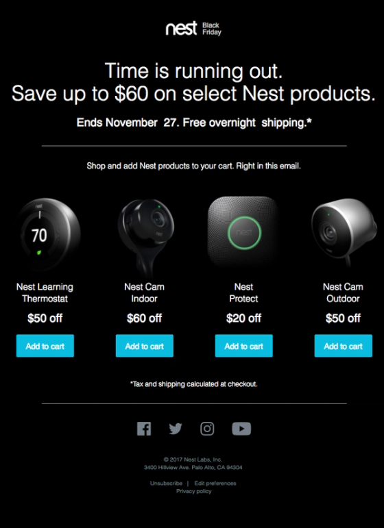
Nest opens with Time is running out, shows the sale deadline, and displays individual product savings with add-to-cart buttons.
Why it works: The email communicates both the time remaining and the value of the promotion. Customers can compare actual savings and move directly toward the products they want.
Black Friday email tip: If your final reminder features several products, show the savings for each one and state the actual deadline. Specific product-level discounts make the closing message more useful than a generic last-chance announcement.
Choose the design that fits your campaign
Start by deciding what each Black Friday email needs to accomplish. The stage it belongs to settles most of the design questions before you open a template: what goes at the top, how much product to show, and whether the deadline or the offer carries the message.
Once the campaign plan is in place, choose designs that communicate those messages effectively and adapt them to your products, offers and brand.
For the strategy these designs serve — which products to promote, which customers should see which offer, and how often — read Black Friday email marketing strategy. For the format question underneath every example here, design-heavy vs text-heavy emails and designing mobile-first are the two to read next.
Nexie is an AI-native ESP for e-commerce brands. It reads your customer data across engagement, recency, category interest and lifetime value together, surfaces the audiences worth campaigning to, and builds those campaigns for your team to review and approve, inside the guardrails and marketing policies you set. See how it works →